


With the enormous use of mobile devices for browsing the internet, it has become essential for websites to be responsive. Now, every client demands a mobile version of their website. And as a web developer, the skill of responsive web design is very important for you to grow in this field.
But, if you are struggling with responsive web design as a new web developer, then this article is for you. Because in this article, we will discuss responsive web design using HTML and CSS from start to end in detail. So, let’s get started:
What is Responsive Web Design?
Responsive web design is an approach to web design that allows websites to adapt their layout and content to fit the screen size of different devices. It means that websites can be viewed easily on mobile phones, tablets, laptops, and desktops without any loss of functionality.
Benefits of Responsive Web Design
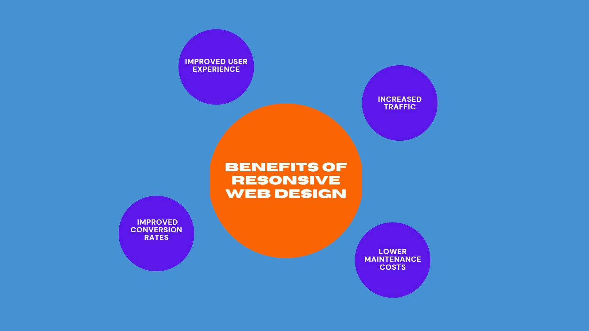
There are several benefits of responsive web design. These include:
1. Improved User Experience:
A responsive website provides a better user experience by adapting to the device’s screen size. It means that users can easily navigate the websites on their mobile phone, tablet, or desktop, without having to zoom in or scroll horizontally.
2. Increased Traffic:
With more people using mobile devices to browse the internet, having a responsive website can increase your website’s traffic. Responsive websites are also favored by search engines, which can improve your website’s search engine ranking.
3. Lower Maintenance Costs:
With a responsive website, you only need to maintain one website rather than multiple versions for different devices. This can save you time and money on maintenance costs.
4. Improved Conversion Rates:
A responsive website can improve your conversion rates by providing a better user experience, which can lead to more sales or leads.
How to Create a Responsive Website Using HTML and CSS
Creating a responsive website using HTML and CSS involves the following steps:
1. Use Responsive Meta Tags:
The first step in creating a responsive website is to use responsive meta tags in the HTML code. Meta tags are used to provide information about the webpage, such as the author, description, and keywords. Responsive meta tags are used to tell the browser that the website is designed to be responsive and should adjust its layout and content according to the device’s screen size.
To add responsive meta tags to your website, add the following code to the head section of your HTML document:

This code tells the browser to set the viewport’s width to the device’s width and the initial scale to 1.0. This ensures that the website is displayed at the correct size on all devices.
2. Use Fluid Layouts:
The next step in creating a responsive website is to use fluid layouts. A fluid layout is a layout that adjusts its width according to the size of the viewport. This means that the layout will adjust to fit the screen size of the device, whether it’s a mobile phone, tablet, or desktop.
To create a fluid layout, use percentage values for the width of the elements in the layout. For example, instead of setting the width of a container to a fixed value, such as 960px, set it to a percentage value, such as 90%. This will ensure that the container adjusts its width according to the size of the viewport.
3. Use Responsive Images:
Images are an important part of any website, but they can also slow down the website’s load time if they are not optimized for different devices. Therefore, it is essential to optimize images for different devices to ensure they load quickly and look good.
One way to make images responsive is to use the srcset attribute in HTML. The srcset attribute allows you to specify multiple images with different resolutions and sizes for different devices. The browser then chooses the appropriate image based on the device’s screen size and resolution.
To use the srcset attribute, add the following code to your HTML:
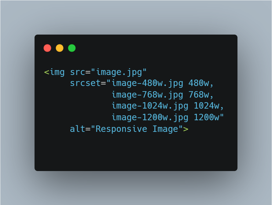
In the above code, we have added the srcset attribute to the img tag. The srcset attribute contains a list of images with different resolutions and sizes, separated by commas. Each image is followed by a width descriptor, which specifies the width of the image in pixels. When the browser loads the webpage, it examines the device’s screen size and resolution and chooses the appropriate image from the srcset attribute.
4. Use Media Queries:
Media queries are used to apply different styles to a webpage based on the device’s screen size. They allow you to create different layouts and styles for different devices, which makes the webpage more responsive.
To use them, add the following code to the end of your CSS file:
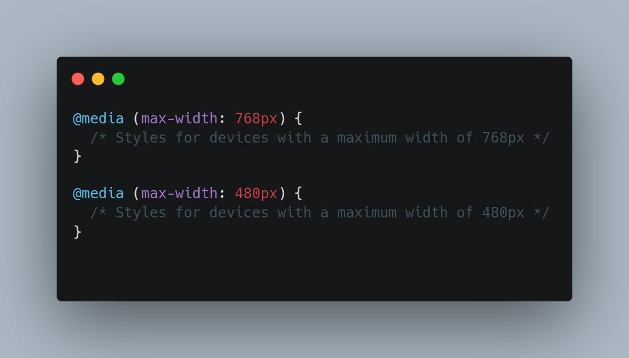
In the above code, we have used two media queries. The first media query applies styles to devices with a maximum width of 768px, while the second media query applies styles to devices with a maximum width of 480px.
5. Use Flexbox:
Flexbox is a CSS layout module that allows you to create flexible and responsive layouts. Flexbox allows you to easily align and distribute elements within a container, which makes it ideal for creating responsive layouts.
To use Flexbox, add the following code to your CSS file:
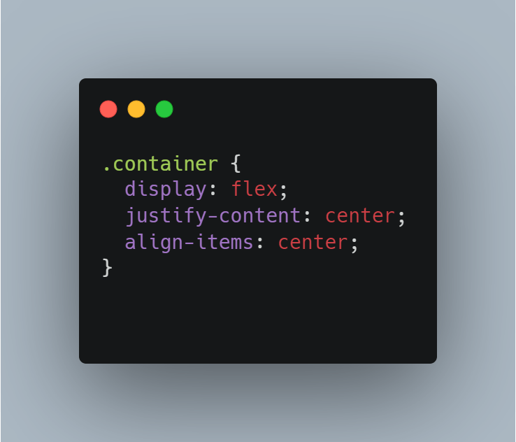
In the above code, we created a container using the display property with a flex value. We have also used the justify-content and align-items properties to center the content within the container.
Final Words:
Responsive web design is essential for creating websites that can be easily viewed on different devices. HTML and CSS provide the tools necessary to create responsive websites, including responsive meta tags, fluid layouts, responsive images, media queries, and Flexbox. By following these steps, you can create a website that provides a great user experience on all devices, improves your website’s traffic, and increases your conversion rates.